Defining the Template Layout
When you add components to a template, you create a grid of components. You can place new components between two components or add them to the very left or right on the template. You can also place the new component above, between or below a component in the same column.
The first component you add takes one third of the template width. It determines the width of the other components you add.
• If you do not resize the first component, all other components that you add will have the size of one third of the initial template width.
• If you resize the first component, all following components that you add have the same reduced or enlarged size.
This also applies when you later edit a template and resize the first component on the left-hand side: any new component you add will have this size. Already added components will not be resized on the template.
Note the following limitations:
• You can decrease the component width on the template until a minimum width is reached (that allows displaying one button).
• Within a column, all component have the same width; you currently cannot enlarge a component into another column.
• You currently can only resize the height of button and text components. You can decrease the component height on the template until a minimum height is reached (that allows displaying one button).
As soon as you add more components than can be displayed at the same time on the visible template area, a scroll bar is shown. Use the scroll bar to move the template up or down or to the left or right if you want to place the new component to an area that is currently not shown. Alternatively, you can use the auto-scrolling feature of the Log app when you place a component to the top or bottom within a column or to the very left or right side of the template.
The position of the component on the template determines the sequence of the same named columns in the Text Logging area. The position of the components on the template is evaluated from left to right, and top- down within a column. Components within a column on the template are shown in the span grid before the next component to the right.
You add and move components into what are called drop zones on the template. There are five drop zones: top, bottom, left, right, and center (vertically between two components; horizontally between two components within a column). Each drop zone is highlighted in blue to help you identify where the component will be positioned within the template when you release the mouse button. When adding components to a template, drop zones are shown as dimmed rectangles, when moving components within a template as solid bars.
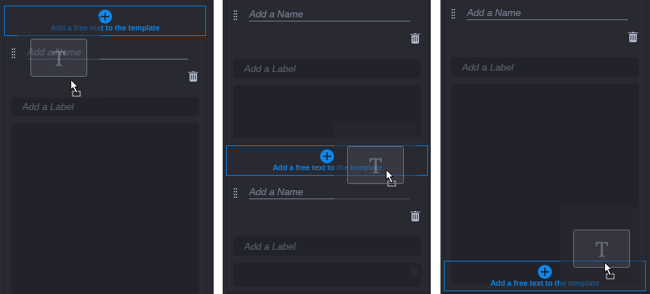
The following illustration shows left, center, and right drop zones (left to right) when adding components.
The following illustration shows top, center, and bottom drop zones (left to right) when adding components.
To place a component:

To add a new component, click the component in the Toolbox and drag it to a drop zone on the template.
To cancel placing the component, do one of the following before releasing the mouse key:
- Press the Esc key.
- Drop the component back to the toolbox.
To resize a component:
Click the right or bottom border of a component and drag the divider that is shown.
| To increase the component width, drag the divider to the right.
To decrease the component width, drag the divider to the left. Neighboring components do not change their width but are moved to the left or right on the template accordingly. |
| To increase the component height, drag the divider down.
To decrease the component height, drag the divider up. Neighboring components do not change their height but are moved up or down within the column accordingly. |
To move a component on the template:
1. Click the drag handle of the component.
2. Drag and drop it to a drop zone.