Opening MediaCentral Cloud UX and Browsing Your Databases
Your administrator will provide you with information for signing in to MediaCentral Cloud UX. (For details, see
Basics of MediaCentral Cloud UX). After you sign in, the MediaCentral Cloud UX window opens with the Browse app displayed. The following illustration shows the Browse app opened, with databases from three workflow modules displayed:
• MediaCentral | Asset Management (shown here as ASSET-MNGT)
• MediaCentral | Newsroom Management (shown here as NEWSROOM)
• MediaCentral | Production Management (shown here as PRODUCTION)
The Browse app displays the modules that are configured for your system. Your system might be configured with more or fewer modules than those illustrated here.
The Fast Bar
Before browsing a database, let’s take a look at the Fast Bar. It’s located at the top of the MediaCentral Cloud UX window and has several groups of icons that represent apps that you can open.
We already have the Browse app open, so the icon is highlighted and colored dark blue (each app has its own color). Hover your mouse pointer over an icon and a tool-tip with the name of the app is displayed. For more information about the different apps that are available in the Fast Bar, see
Understanding the Fast Bar.
The Browse App
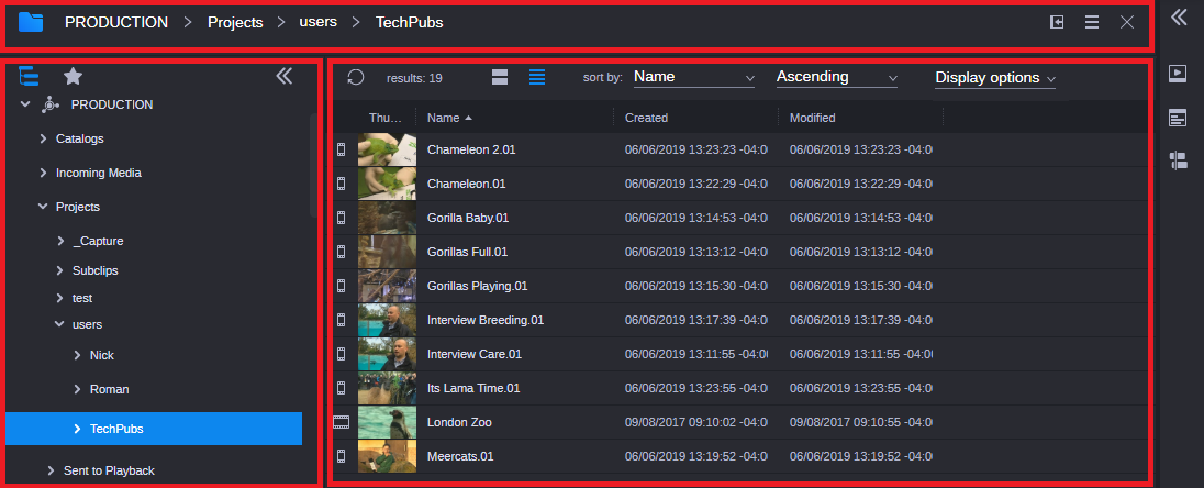
Now, back to the Browse app. It’s divided into three sections: the app header at the top, the Directory sidebar on the left, and the toolbar and Results area on the right. The following illustration shows these three areas and the contents of the folder named “TechPubs.”
Top: App header. Left: Directory sidebar. Right: toolbar and Results area.
• The app header displays the Browse app icon, the path to the open folder (or breadcrumbs), the Dock/Undock button, the App Menu button, and the Close button.
• The Directory sidebar gives you access to the MediaCentral modules that are configured for your system. The directory uses a familiar tree structure. Use the turn-down arrows to navigate through the tree structure and display the contents of a folder.
• The toolbar above the Results area gives you a range of options for changing how assets are displayed. The assets in the previous illustration are shown in List view. In addition to List view, you can display assets in Card view, as shown in the following illustration.
You also have various ways you can sort the results, and can select which attributes to display in the list. For more information, see
Understanding the Layout of the Results Area.
Hoverscrub
If you want to quickly preview a clip, you can use the hoverscrub feature (if your system is licensed for it). Just place your cursor over an image in Card view and after a moment, a vertical bar appears that allows you to scrub the asset by dragging your cursor to the left or right.
Docking an App
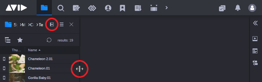
The left side of the MediaCentral Cloud UX window is the place where you can dock an app. It’s where you can store an app you’re only using on occasion. To dock an app, click the Dock button. The app collapses to a narrow view to the left side, available for use but not occupying primary screen real estate. After you dock the app, you can click the separator bar and use the double-headed arrow cursor to enlarge or reduce the dock space. The following illustration shows the Browse app docked, with the Dock button and the double-headed arrow cursor circled.
To restore the app to take up the full screen, click the Dock button again. You can dock any
core app (such as Browse or Search), but you can only dock one app at a time. For more information, see
Docking Apps.

You might need to review your User Settings before starting your work. You will probably need information from your administrator to complete most of these settings. For more information, see
User Settings.