Using Filters
The Filter option in the Search sidebar enables you to limit search results based on commonly used metadata fields such as duration, asset type, and more. These filters are similar to the options available through the Search Type menu. However unlike search terms, filters are paired with non-customizable modifiers.
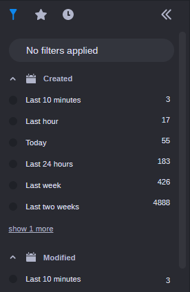
For example, the Created filter (illustrated below) includes a set of predefined, non-modifiable date ranges. If you select the same Dates: Created option through the Search Type menu, you can customize the term to include a specific date or date range.
Each item in the Filters tab is displayed with a filter name and associated qualifiers. For instance, the Created filter includes qualifiers such as Last 10 Minutes, Last 24 Hours, and others. The number to the right of each filter indicates how many assets match this filter.
The Created and Modified filters both include Today and Last 24 hours filters. While the Last 24 hours filter displays assets for a 24 hour period, the Today filter displays only those assets created or modified between 12:00am and the current time. You should note that these filters respect the time zone of the local client. This means that if you are working with a coworker in a different time zone, their search results might be different than yours.
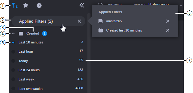
You can click the name of the filter or button to the left of it to add the filter to your search. When you make a selection, the filter is applied immediately and the search results area is populated with matching assets. Additionally, the Filter button in the sidebar header and the Applied Filters button are both updated to reflect the change. The following illustration shows the Filter menu with two filters enabled.
| Name | Description |
1 | Filter button | When you select a filter, a number appears to the right of this icon to indicate the number of filters currently enabled. |
2 | Applied Filters | Displays the number of applied filters. If you click this button, the Applied Filters fly-out window appears. If you click the X on the right of the Applied Filters button, the Filter list is reset and all filters are cleared from your search. |
3 | Filter Name | Displays the category label. If you select any filters within a category, a counter appears to the right of the name to identify the number of filters within this category that you have added to the search. |
4 | Expand / Collapse | Click the button to the left of the filter name to collapse or expand this filter category. |
5 | Qualifier selection box | Used to enable and in some cases disable a filter. When enabled, one of two types of marks appears in the selection box: • A bullet point appears in the box if you can select only one qualifier for the filter. For example, you can only select a single option when using the Created filter. If you want to disable this type of filter, you must deselect it through the Applied Filters fly-out menu. • A check mark appears in the box if you can select more than one qualifier with the filter. For example, the System category of filters allows you to select multiple options. If you want to disable this type of filter, you can either click on the selection box again to remove the check mark or you can disable it through the Applied Filters fly-out menu. |
6 | Applied Filters (fly-out) | If you click on the Applied Filters header, a fly-out window provides more detail on the selected filters. You can click the X to the right of any filter to remove it from the list. |
7 | Asset count | Displays the number of possible assets for each filter / qualifier. After you apply a filter, the Search app updates the asset count for all other filters to help you identify the number of assets that match your filter(s). The following illustration provides an example in which the Created filter modifies the asset count for the various asset types. |

You cannot modify or customize the list of filters in this release of MediaCentral Cloud UX.
The sidebar displays up to six selections for each filter category by default. In some cases such as the System and Type filters, the app might display a “show more” or “show all” button that allows you to select from additional filter options. If the category includes six or fewer additional selections, you can click the Show More button to expand the category directly within the sidebar. If the category is associated with more than six options, you can click the Show All button to open a break-out window that displays all possible filters for that category.
If the list of filters extends beyond the size of the window, a scroll bar appears to the right of the list that allows you to navigate to the additional filter options.
Phonetic Term Proximity
When you create a search that includes multiple phonetic-based search terms, a new Phonetic Term Proximity filter appears at the top of the list. This filter allows you to narrow your phonetic search results by location in the asset. In the following before-and-after illustration, the user created a search for two phonetic terms: species and penguin.
The illustration on the left shows that the search returned one asset with both of these terms, and there are a total of five occurrences of these phrases in the asset. Because the search is configured to search for both terms in the same asset (the & operator), the Phonetic Term Proximity filter is added to the sidebar.
In the illustration on the right, the user has selected the “Within 15 seconds” filter to narrow the search to only show assets where both of these terms appear within 15 seconds of each other. Notice that after the filter is applied, the same asset is returned, but with a different number of matching hits.
In either case, you can use the In-Line Hits window to obtain more information about each phonetic hit. For more information, see
Using the In-Line Hits Window.